


 How to resolve AdBlock issue?
 - Posts: 987
- Thank you received: 1830
×
Bugs: Recent Topics Paging, Uploading Images & Preview (11 Dec 2020)
Recent Topics paging, uploading images and preview bugs require a patch which has not yet been released.
×
Talk about the latest and greatest AT, and the Classics.
The World Reapers or Cosmic Frog
03 Oct 2019 11:40 #302178
by DarthJoJo
Replied by DarthJoJo on topic The World Reapers or Cosmic Frog
I would consider putting the upper left icons on a black bar to stand out from the art. Maybe it’s not so much an issue on other pieces, but here they get a little lost when they’re next to those suns or moons in the same corner.
Maybe a stronger font, too? A serif? It’s very legible, which is priority one, but it’s also boring.
Maybe a stronger font, too? A serif? It’s very legible, which is priority one, but it’s also boring.
The following user(s) said Thank You: xthexlo
Please Log in or Create an account to join the conversation.
- Cranberries
-

- Offline
- D10
-

- You can do this.
Less
More
- Posts: 3087
- Thank you received: 2379
04 Oct 2019 23:12 #302212
by Cranberries
Replied by Cranberries on topic The World Reapers or Cosmic Frog
I would like to see the card text more organized and less sprawling, but I teach technical writing and lean towards the functional. I *love* the art.
The following user(s) said Thank You: xthexlo
Please Log in or Create an account to join the conversation.
05 Oct 2019 08:32 #302214
by xthexlo
Thanks for this comment, but I don’t understand what you mean. Could you please elaborate or give me an example? Are you talking about the visual presentation of the text, or the sentence structure of the text?
Replied by xthexlo on topic The World Reapers or Cosmic Frog
CranBerries wrote: I would like to see the card text more organized and less sprawling
Thanks for this comment, but I don’t understand what you mean. Could you please elaborate or give me an example? Are you talking about the visual presentation of the text, or the sentence structure of the text?
Please Log in or Create an account to join the conversation.
13 Oct 2019 16:42 #302441
by xthexlo
Replied by xthexlo on topic The World Reapers or Cosmic Frog
So... this is what I'm thinking...

The following user(s) said Thank You: Turek, Gary Sax, Jackwraith, hotseatgames, birdman37, cdennett, DarthJoJo, Vysetron
Please Log in or Create an account to join the conversation.
- Cranberries
-
- Offline
- D10
-
- You can do this.
Less
More
- Posts: 3087
- Thank you received: 2379
13 Oct 2019 17:11 - 13 Oct 2019 17:12 #302442
by Cranberries
I am referring to the spatial arrangement of the text.
What mythos is the world eating frogs from? I think I've seen it in BPRD (the comic)

Replied by Cranberries on topic The World Reapers or Cosmic Frog
xthexlo wrote:
CranBerries wrote: I would like to see the card text more organized and less sprawling
Thanks for this comment, but I don’t understand what you mean. Could you please elaborate or give me an example? Are you talking about the visual presentation of the text, or the sentence structure of the text?
I am referring to the spatial arrangement of the text.
What mythos is the world eating frogs from? I think I've seen it in BPRD (the comic)
Last edit: 13 Oct 2019 17:12 by Cranberries.
The following user(s) said Thank You: xthexlo
Please Log in or Create an account to join the conversation.
14 Oct 2019 12:53 #302458
by xthexlo
It’s part of the Shadows of Malice mythos. The teaser text at the start mentions Aethos (the world in Shadows of Malice) as one of the four largest fragments of Aeth.
I wanted to make a game where you could play the “reaper engines” that the old gods of Aeth would use to re-assemble the broken world. In the end, those engines took the form of gigantic frogs.
Replied by xthexlo on topic The World Reapers or Cosmic Frog
CranBerries wrote: What mythos is the world eating frogs from?
It’s part of the Shadows of Malice mythos. The teaser text at the start mentions Aethos (the world in Shadows of Malice) as one of the four largest fragments of Aeth.
I wanted to make a game where you could play the “reaper engines” that the old gods of Aeth would use to re-assemble the broken world. In the end, those engines took the form of gigantic frogs.
The following user(s) said Thank You: hotseatgames
Please Log in or Create an account to join the conversation.
14 Oct 2019 14:03 #302459
by Vysetron
Replied by Vysetron on topic The World Reapers or Cosmic Frog
That art is staggeringly good. Yes please.
Please Log in or Create an account to join the conversation.
09 Dec 2019 15:03 #304945
by xthexlo
Replied by xthexlo on topic The World Reapers or Cosmic Frog
Okay, here’s some information for y’all.
Devious Weasel Games pages for Cosmic Frog are now up:
deviousweasel.com/cf0
Boargamegeek page for Cosmic Frog is now up:
boardgamegeek.com/boardgame/295905/cosmic-frog
More to come!
Devious Weasel Games pages for Cosmic Frog are now up:
deviousweasel.com/cf0
Boargamegeek page for Cosmic Frog is now up:
boardgamegeek.com/boardgame/295905/cosmic-frog
More to come!
Please Log in or Create an account to join the conversation.
- Dr. Mabuse
-

- Offline
- Ambassador of Truth
-

10 Dec 2019 03:43 - 10 Dec 2019 03:44 #304958
by Dr. Mabuse
Replied by Dr. Mabuse on topic The World Reapers or Cosmic Frog
My 2 cents, drop the outline around icons. You will achieve better results especially from a distance by having to icon and background colours contrast.
For instance take the outline colour around the outside of circle and change the inner circle to that colour (then remove the redundantly coloured outline). Remove outline around the icon. For the lock change the colour from grey to white. They will be faaaar easier to read even from a distance.
If you want all three icons to stand out from the background move them over a couple of inches then add translucent dark-coloured rectangle (opacity at 10-15%) behind them, that bleeds off the top.
Last edit: 10 Dec 2019 03:44 by Dr. Mabuse.
The following user(s) said Thank You: xthexlo
Please Log in or Create an account to join the conversation.
14 Dec 2019 11:54 #305109
by xthexlo
Replied by xthexlo on topic The World Reapers or Cosmic Frog
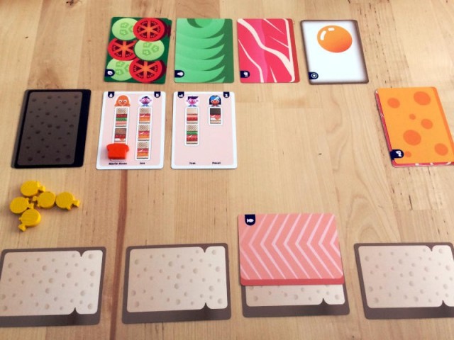
Thanks to everyone who took the time to send me their thoughts, comments, and suggestions regarding Cosmic Frog! I really appreciate all of your input! As a special thank you, here's a few samples of how the ability cards are shaping up (still tweaking banner sizes and such, but you'll get the ideas)...


The following user(s) said Thank You: Gary Sax, Dr. Mabuse, Jackwraith, hotseatgames, birdman37, cdennett, Nodens, BillyBobThwarton, Ah_Pook, Vysetron
Please Log in or Create an account to join the conversation.
28 Dec 2019 14:57 #305592
by xthexlo
Replied by xthexlo on topic The World Reapers or Cosmic Frog
The back of the box seems to be shaping up pretty well. What'cha think?

The following user(s) said Thank You: Jackwraith, hotseatgames
Please Log in or Create an account to join the conversation.
- hotseatgames
-

- Offline
- D12
-

Less
More
- Posts: 7188
- Thank you received: 6323
28 Dec 2019 17:56 #305600
by hotseatgames
Replied by hotseatgames on topic The World Reapers or Cosmic Frog
Some thoughts, which I'll preface by saying that I am not a graphic designer, nor a marketer, so what the hell do I know.
- I think it is jam-packed with information and could stand to have less of it, to give it some room to breathe.
- One way to do this would be to reduce the amount of text: perhaps reduce the bullet point text down to 2 or 3 words each. For example: ENGAGE IN COSMIC COMBAT!
- If you leave them as is, read them aloud to yourself first because there are at least two typos in the bullet points
- THANK YOU THANK YOU THANK YOU for not using the phrase "highly detailed miniatures". That phrase makes me want to puke.
- Perhaps another way to make some space would be to only show part of the board. It dominates the background, when what you should really push are those GORGEOUS cards.
- Part of me wishes that the only thing on the back was, in giant letters, THIS IS NOT A TOY
")
Please Log in or Create an account to join the conversation.
28 Dec 2019 17:58 #305601
by xthexlo
Replied by xthexlo on topic The World Reapers or Cosmic Frog
Thanks, Mark! I'm still working on it. I appreciate your thoughts immensely and will take your comments to heart!
The following user(s) said Thank You: hotseatgames, WadeMonnig
Please Log in or Create an account to join the conversation.
Less
More
- Posts: 1460
- Thank you received: 1206
28 Dec 2019 18:10 #305602
by WadeMonnig
Replied by WadeMonnig on topic The World Reapers or Cosmic Frog
The "Huge Tracts of land" is totally a Monty python moment for me, intentional or not.
Please Log in or Create an account to join the conversation.
- Jackwraith
-

- Offline
- Ninja
-
- Maim! Kill! Burn!
Less
More
- Posts: 4382
- Thank you received: 5724
28 Dec 2019 18:20 #305604
by Jackwraith
Replied by Jackwraith on topic The World Reapers or Cosmic Frog
I agree with hotseat about the typos, as that's the first thing that stuck out to me, too. Sorry. Editor thing. And there is a lot of info to absorb, but I wasn't put off by it. I think there's room for that in the overall design. But he's totally right about the cards being the real eye-catcher. I'd try to emphasize them in some fashion. If possible, I'd try to not deemphasize the minis, though. People like minis and you will make sales simply from having them. Rising Sun is a pristine example. I guarantee that that game moved like it did because of the plastic. The fact that they were tied to an excellent game just kept the snowball rolling. Same thing could happen here.
Really looking forward to this.
Really looking forward to this.
The following user(s) said Thank You: hotseatgames, BillyBobThwarton
Please Log in or Create an account to join the conversation.
Moderators: Gary Sax
Time to create page: 0.560 seconds